Good and bad websites
Good websites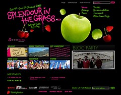
This is an example of a well set out website. The heading and titles are easy to read, and the links stand out form the background. Everything on the site is well spaced out and easy to read. The choise of font colours work fairly well together and are well seperaited form the background. All the images are bright and the black background makes them stand out on the page. Links change colour when the mouse hovers them so you know what you are selecting. The design its self is pritty simple but works well to premote the event. movement is kept to a minium to help highlight the premotional band photo slideshow.
Overall the page is fairly astheticly pleasing and must of work well considering the event sold out in less than a day. By the way I missed out on tickets so if anyone knows where i can get a ticket let me know.
splendour in the grass
Bad websites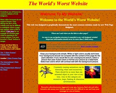
This is possible the best example on the net of how not to make a website. As the site says it is the worst website on the internet. This is true for a number of reasons. For starters it takes to long to load which is frustraiting enough. The colour sceme is terrible and the moving background is annoying. It has pop up ads, possibly the most annoying thing on the internet. Infact it has examples of pritty much everything you shuld not do when making a website. So while it is astheticly terrible it is done to show others making a website things that shuld never be done. That being said these exact thing are all to comonly found while brousing the internet. Perticually on amature websites.
worlds worst website
![]()


No comments:
Post a Comment